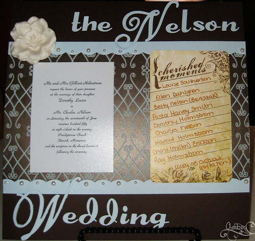
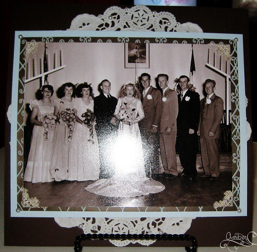
Enough talking, here is the layout! OH, please don't mind the glare. I had a hell of a time getting pictures of these for some reason. If anyone has tips for taking pictures of layouts please share!!!


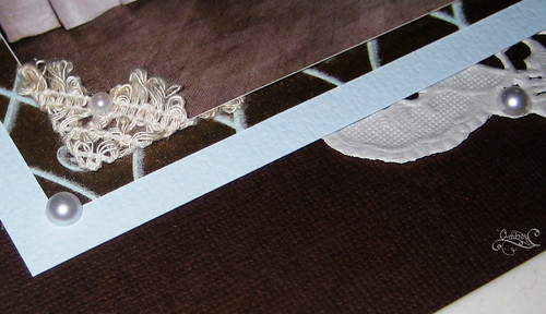
I took this last picture to show a close up of the textures and dimension of it. The brown paper with blue is actually flocked and soft! (It's old Heidi Grace paper.) I used some old lace that I had on hand to make the photo corners. Yes, that is an actual paper doily behind the picture, and I used Kaiser Kraft pearls as well. The Cardstock is Bazzil (I had none of my yummy dark brown American Crafts :() I cut out the title myself out of cardstock using my Quickutz Alphabets. The Flower on the first page is from Prima and is one of their new releases! LOVE IT!

4 comments:
Wow that is amazing. You are really talented.
that is absolutely gorgeous! Can you make a copy so I can hang it on my wall?
Thanks Jess and Ma. :)
Ma, I can try to make a copy for you. I might have a hard time finding the background paper. I can't remember if I bought only 2 sheets or if I bought 4. But I can definitely do something very similar.
What a beautiful layout. How cool that you had a copy of the invitation too!?!
To take photos of paper, etc without glare it's best to use natural, indirect light...so if you can, take photos by a big window (in the summer, outside). Partly cloudy days actually work a little better than bright sunny days, or just wait until an hour or two before the sun sets.
Post a Comment